
When most people are sleeping, I’m either working out or researching. Today, how about I just share my weekend research with you?
“In the short-run, the market is a voting machine… but in the long-run, the market is a weighing machine.” – Warren Buffett paraphrasing his mentor Benjamin Graham
My interpretation of this brilliant, succinct statement of the types we’ve come to expect from Warren Buffett, is that in the short-term, markets trade based on investor emotions (or things like high-frequency trading), but, over the long-term, fundamentals ultimately determine price. In other words, over the long-term, price will accurately reflect the fundamental value of a company even if there is a bunch of noise in the interim.
Therefore, reliably predicting short-term price movements is impossible and a waste of time. This is why I caution folks against trying to play that short-term trading “game” because they simply don’t have an edge in that game. HOWEVER, forecasting longer-term returns (10-12 years out) is a much more worthwhile, and important, endeavor. The reason it’s so important is because we can use probabilities of future return potential to plan our financial future and help us make the most important financial decisions, such as:
- How should my portfolio be invested today? Should I be relatively aggressive or conservative or somewhere in between?
- What’s the risk/return tradeoff of the market for the next decade?
- Should I pay down debt or contribute money to my investment portfolio?
- What’s a reasonable expectation for retirement (or any other financial goals)?
Let me illustrate this concept.
The first chart below shows a few things. The *green line* shows us a valuation metric called the Shiller Price-to-Earnings Ratio (Shiller PE). In other words, think of the green line showing you the price you’re paying for the U.S. stock market in the context of history. The higher the line the more expensive the market was and vice versa. The *dashed yellow lines* indicate cyclical peaks in the Shiller PE while the 10-year price returns show you the cumulative gain or loss for the S&P 500 over the next ten years from that cyclical peak (excluding dividends).
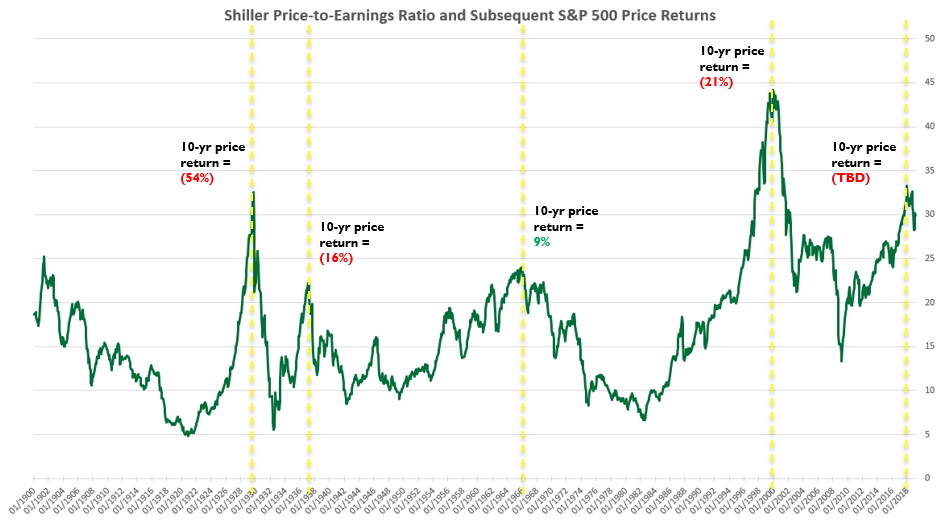
As you can see from the chart above, the 10-year returns are horrendous when starting from a cyclical peak. In other words, when you’ve paid a lot for an asset with a given cash flow, returns were very low / negative. This makes perfect sense. It’s like paying $90-$110 for an asset that is going to deliver $100 to you in ten years. There’s just not a lot of upside there so your upside is limited while your downside is tremendous. That’s a bad risk / reward profile. We’d rather invest in things that have a lot of upside with relatively little downside.
This second chart shows the same valuation metric but, instead of highlighting cyclical peaks, it highlights cyclical troughs along with the subsequent ten-year returns from those points.
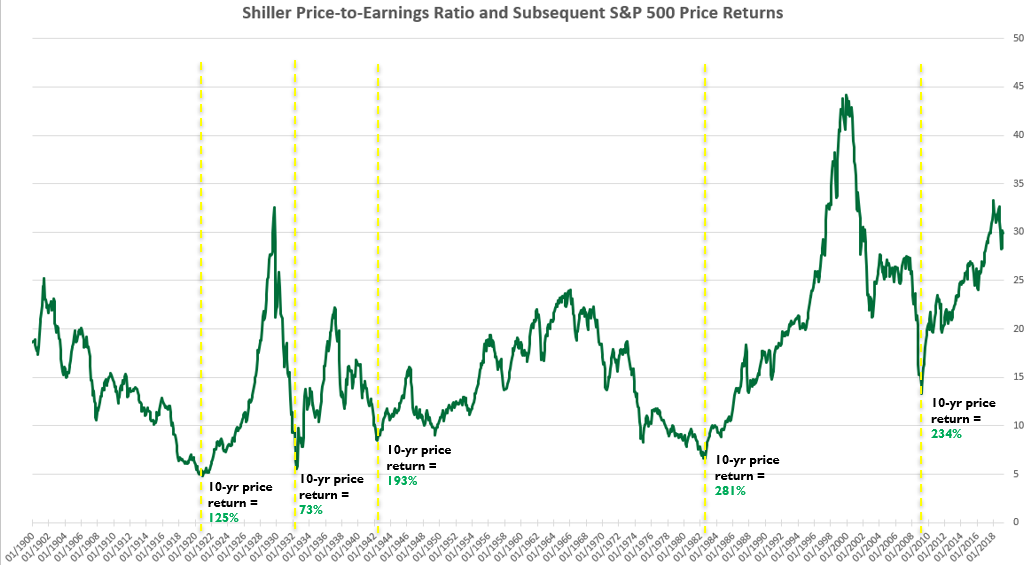
As expected, the returns were far greater. Again, this makes perfect sense. The less we pay for an asset, all else being equal, the greater our return. This would be like paying $50 for that same asset mentioned above that pays you $100 in ten years. You’d have more upside potential with less downside potential. The price you pay, all else being equal, determines the return you receive.
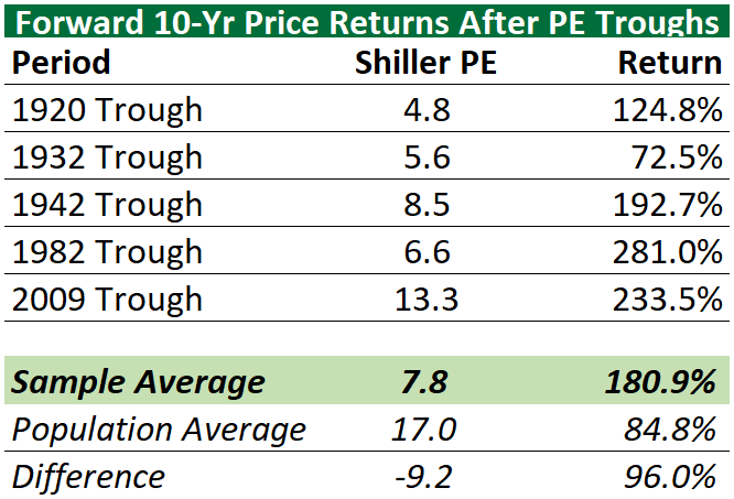
To summarize how starkly different the outcomes were, I prepared these two tables below (one for each chart above). The first table shows the year of the cyclical peak, the respective Shiller PE value at the peak and the subsequent 10-year cumulative price return. I then average all those values at the bottom of the table. The second chart shows the year of the cyclical trough, the respective Shiller PE at those points and the subsequent 10-year cumulative return.
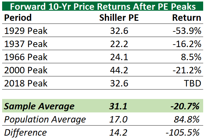
In other words, the average cumulative ten-year return (excluding dividends) from cyclical peaks was a negative 21%…a loss over a ten-year investment period. Imagine how that would impact your financial outcomes and retirement plan if your advisor was planning around historical average returns of about 8% per year for the next ten years?! Needless to say, you’d fall far short of your goals and be extremely displeased. You’d be making critical decisions around misinformed / bad data, which means you’d likely be making bad decisions.
Now, to put that in perspective, the average cumulative ten-year return (excluding dividends) from cyclical troughs was 181%! That’s over a 200% difference!
The ten-year average, cumulative return for all ten-year periods since 1900 was about 85%, not including dividends.
Therefore, by being intelligent and selective about how we’re investing we can potentially greatly exceed long-term average returns. The method to attempt to achieve this goal would be to reduce risk near cyclical peaks and add risk near cyclical troughs. Of course, no guarantee the approach would work, but the probabilities seem to be in our favor.
The question is where are we within the market cycle today? Are we closer to a cyclical peak or a cyclical trough?
You’ll notice from the charts above that the current Shiller PE is about 30 today and got as high as 32.6 in September of 2018 when the U.S. market hit an all-time high. You’ll also notice from the tables above that prior cyclical peaks were characterized by Shiller PEs ranging from 22.2 to 44.2 with an average of about 31. Therefore, it’s clear that the U.S. stock market is currently trading within the upper-end of its historical range. To be clear, this means nothing for the short-term as valuations can remain extended for long periods of time and can even get stretched further as we saw in the dot-com bubble. However, it does imply that U.S. stocks may be near a cyclical peak if they didn’t already peak in September of last year.
So what is the practical implication for portfolios? Well, it means I’m biased to positioning portfolios more conservatively at this point in the cycle. This, of course, is always dependent on each client’s unique circumstances and goals. But, at a minimum, we’re certainly not over-weighting risk at this point. It means we’re looking for a better opportunity to get more aggressive when valuations are much more reasonable using history as our guide. I don’t necessarily agree with maintaining the same portfolio at all times regardless of what historically-reliable valuations are doing. I prefer a more proactive, historically-informed approach.
This approach goes hand-in-hand with another famous Buffett quote, “Be fearful when others are greedy and greedy only when others are fearful.” When valuations are at extremely high levels, meaning when people are paying a lot for an asset, that’s a sign that “others are greedy” and caution is warranted.
Kindest Regards,
Ken
Past performance is no guarantee of future results. All investments maintain risk of loss in addition to gain. Data from third-parties is believed to be reliable but accuracy is not guaranteed. Much of the data used to interpret the markets and forecast returns are often at odds with each other and can result in different conclusions. Many different factors impact prices including factors not mentioned here. This is NOT investment advice but merely a general commentary. Individualized investment advice cannot be provided until a thorough review of your unique circumstances and financial goals is completed.
